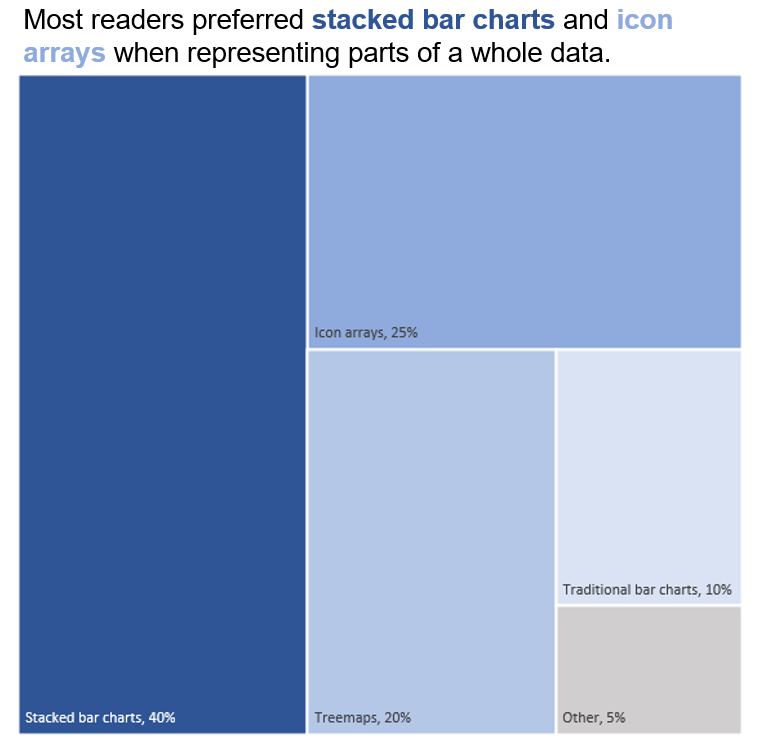
How to Present “Parts of a Whole” Data
Sarah M. Dunifon

Boy looking at a stingray in an aquarium exhibit.
In past posts, we’ve explored how to visually present ordinal data, the importance of color in effective data visualizations, and how to successfully employ color in your graphics. Today, we’ll explore another common data type and how to package it for maximum impact.
“Parts of a whole” data refer to data points that add up to a single sum. In this case, we’re interested in comparing data points to each other and to the total sum, rather than to another sum or set of data. Unlike our ordinal data examples, parts of a whole data typically stand alone and speak for themselves. Pie charts, for example, are often used to represent this type of data. But there are several creative options for visualizing parts of a whole data that extend beyond your standard pie chart.
Let’s discuss four ways to present parts of a whole data in a visual manner.
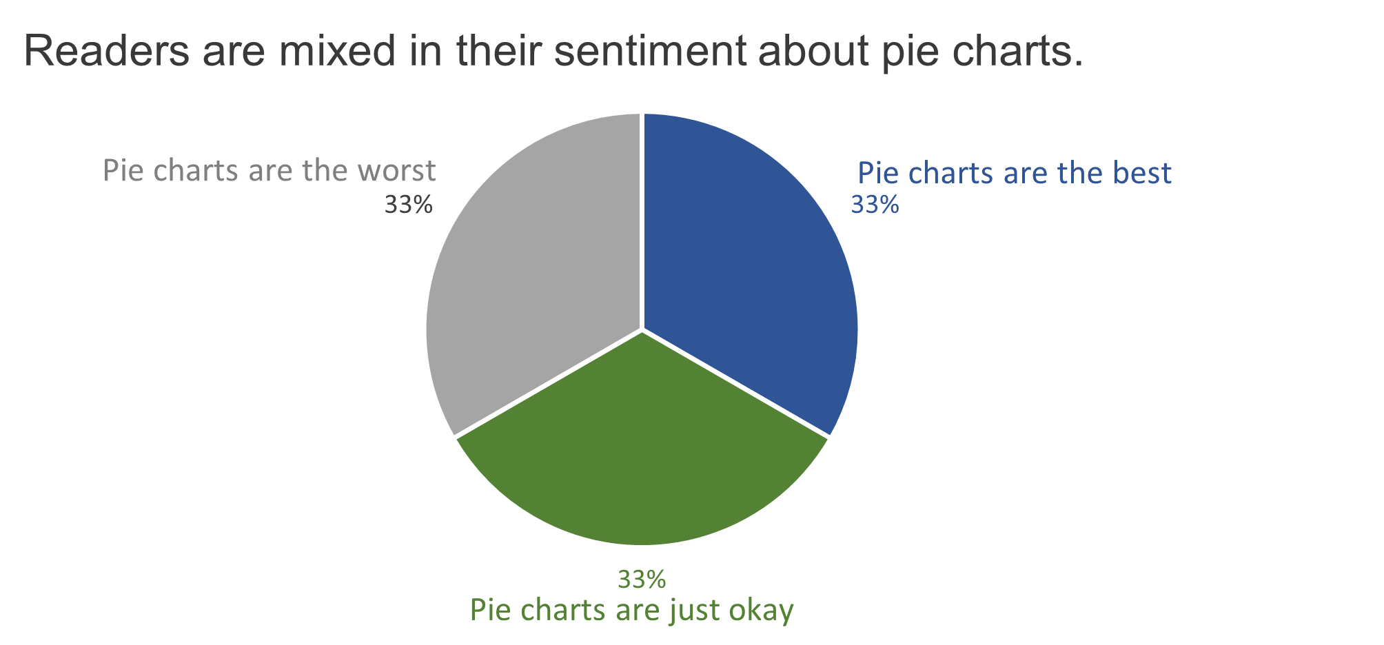
Pie Charts
Pie charts are a classic way to present parts of a whole data. However, they can be controversial. Some data visualization experts think this format can create difficulties in gauging the differences between “slices.” But it is clearly an accessible, compact, and well-known format for this data type.
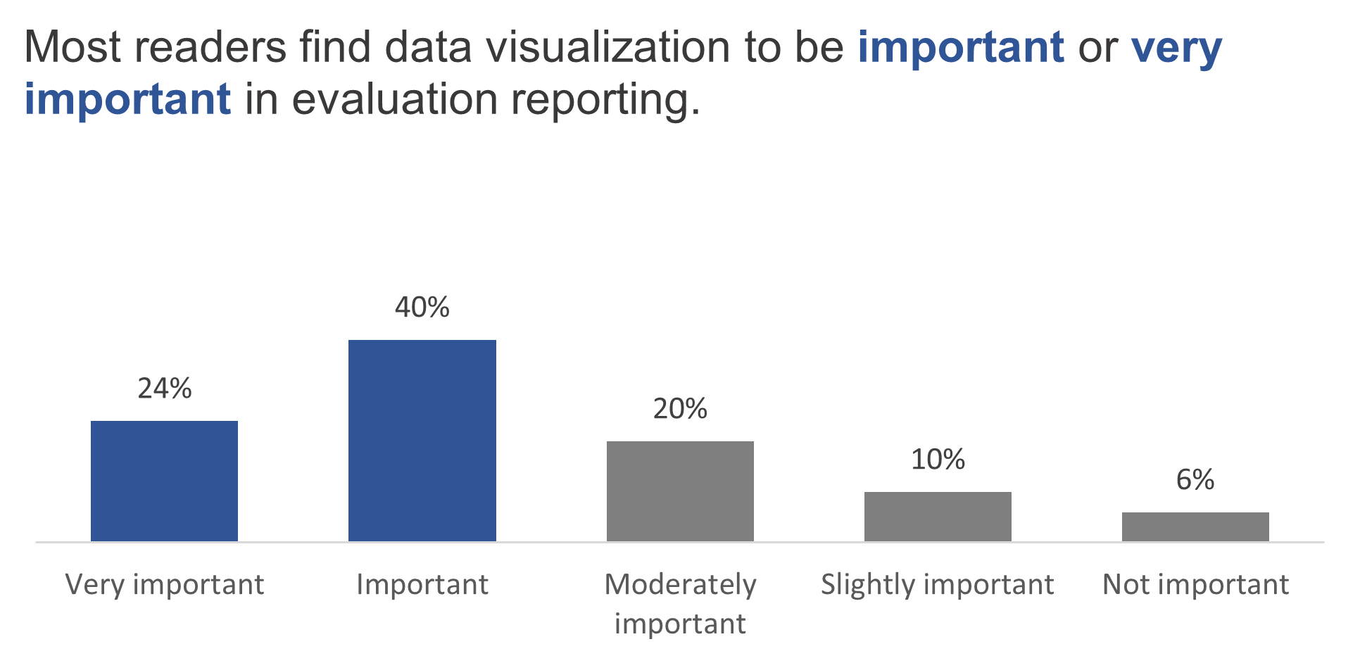
Bar Charts
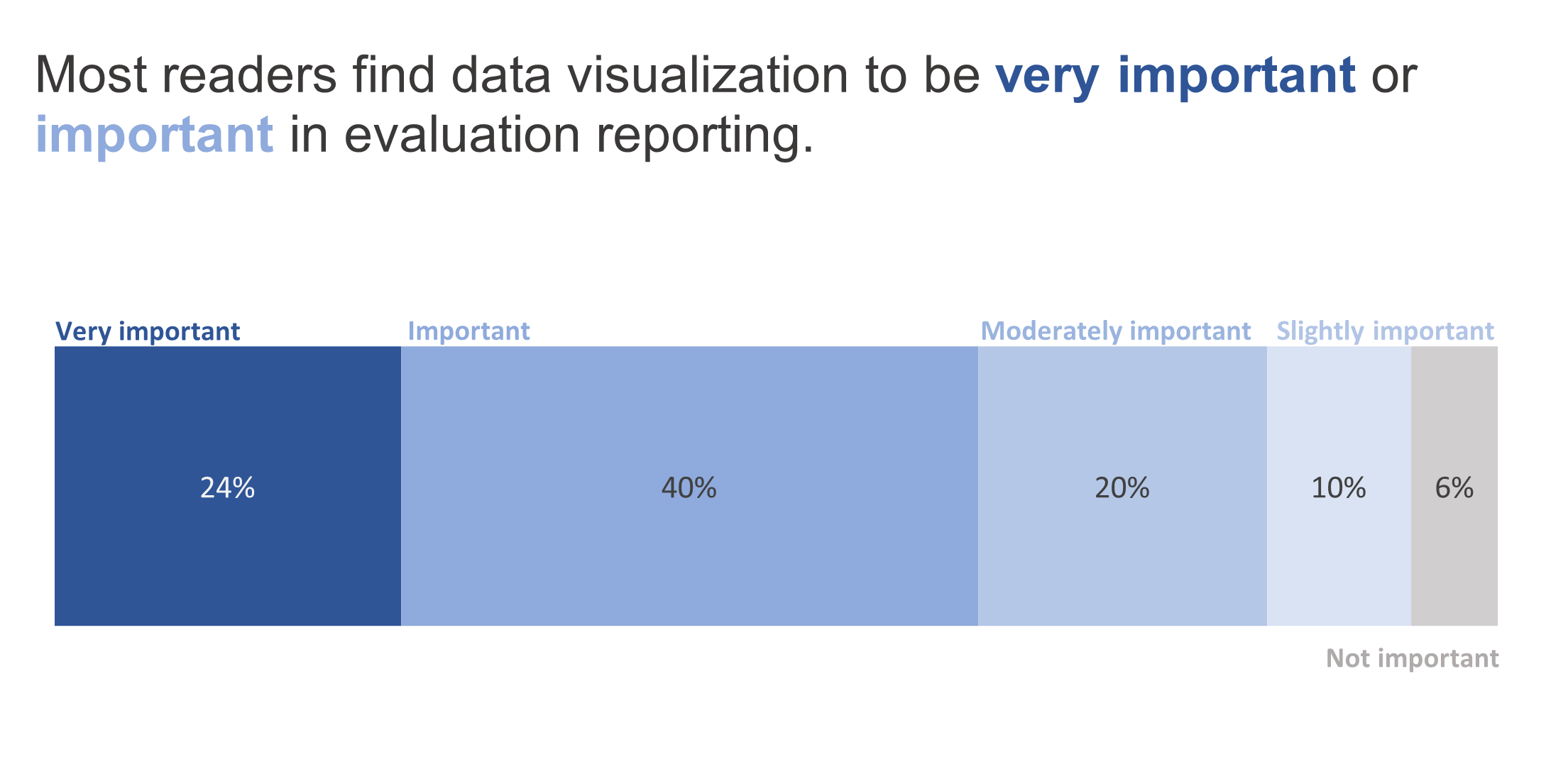
Bar charts are another data visualization that are frequently used to present this data type. Here, the differences between the sections can be more clearly compared. You can employ a traditional bar chart or a stacked bar chart. A traditional bar chart focuses more on the differences between the sections, whereas the stacked bar chart better shows proportionality to the whole.
Traditional bar chart:
Stacked bar chart:
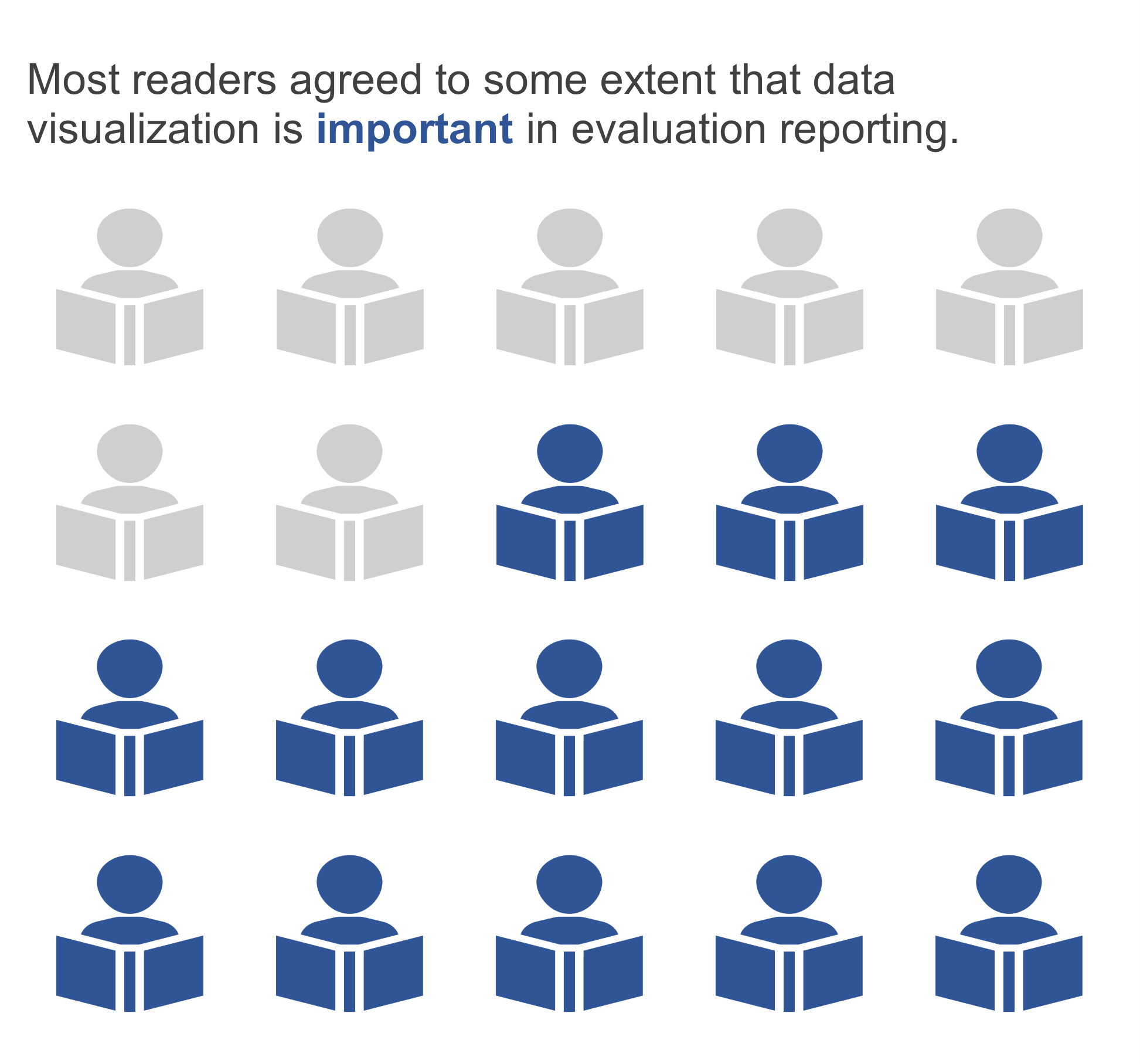
Icon Arrays
When working with parts of a whole data that references small groups of participants, icon arrays can be a good option. Here, icons are used to represent individuals. This is a particularly effective option when numbers are small and percentages are, therefore, less helpful.
Treemaps
Treemaps are an interesting visual representation of parts of a whole data and can be helpful when there are many sections to represent. This visualization type allows for comparison across sections and adds some visual interest to your reporting.
Ready to try these out? Here are some resources to help you get started:
We hope you enjoyed this article! If you’d like to see more content like this as it comes out, subscribe to our newsletter Insights & Opportunities. Subscribers get first access to our blog posts, as well as Improved Insights updates and our 60-Second Suggestions. Join us!