Three Ways to Visually Present Ordinal Data
Sarah M. Dunifon

Child on a hiking trail looking through binoculars toward the camera
Ordinal data are categories that have a meaningful order or ranking (e.g., strongly agree, agree, disagree), but without equal distance between the categories as you might find in numerical data (e.g., 1, 2, 3). Nominal data, by contrast, has no meaningful order or ranking (e.g., red, green, blue).
We use ordinal data a ton in our work evaluating programs. In our case, it typically is scale-based data that reflects participant agreement, confidence, or other attributes towards statements. But ordinal data can be tricky to present in the reporting process.
Here, we’ll explain three ways you can present your ordinal data in a visual manner.
Heat Maps
Heat maps are one of my favorite visuals. They allow you to present all the details, but in a way that ensures the reader picks up on meaningful patterns. Similar to a table, heat maps usually include rows and columns, where each cell represents a data point. Typically, heat maps will depict percentages rather than counts (unless working with very small samples). They are particularly helpful in demonstrating patterns between questions or response options.

Stacked Bar Charts
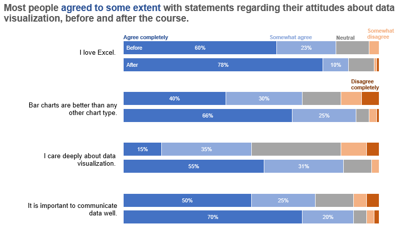
Stacked bar charts are another all time favorite around here. I typically use horizontal stacked bar charts, where I’m able to put the question or response to the left of the bar, and then use intentional color schemes to demonstrate differences between response segments. When working with scale-based data, where parts of the whole are particularly meaningful, stacked bars are a great way to demonstrate response segments in relationship to each other. I also love using them to show the difference between “before and after” data where response shifts can be seen.
Divergent Stacked Bar Charts
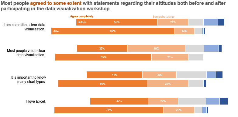
Divergent stacked bar charts are newer to me. Similar to stacked bar charts, these show parts of a whole and are great for demonstrating the difference between statements or responses “before and after” a program. What makes divergent stacked bar charts different is that you’re able to anchor the midpoint of these bars to a neutral response (e.g., between agree and disagree) so that the proportion of responses to the left of the midpoint show the overall respondents in support of the statement (when using agree/disagree for example). Conversely, those to the right show those not in support. This way, you’re able to quickly ascertain overall agreement and disagreement visually.
Ready to try these out? Here are some tutorials from one of our favorite data vis experts, Stephanie Evergreen:
We hope you enjoyed this article! If you’d like to see more content like this as it comes out, subscribe to our newsletter Insights & Opportunities. Subscribers get first access to our blog posts, as well as Improved Insights updates and our 60-Second Suggestions. Join us!